How Material Design helps you brand your app

1. The icon
The first step in building a brand is choosing the icon, because it is the first thing users will see and become attached to, as well as the main reason why they will choose your app among the thousands on Google Play.
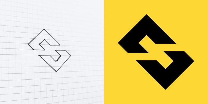
For my example, a URL Shortener, I drew a broken chain link, while trying to enter the initial letter of the app name I thought of (the letter “S”, initial of “Sh-ort”).
I took pen and paper and started my drawing session until I arrived at a satisfying result, which was simple, recognizable and with a characteristic shape never seen before.

2. The branding
Now that we have designed the icon we also have a clear idea of what the app will look like.
Here, Material Design comes to the rescue with its macro rules: Color, Typography, Shape.
It is easy to predict that the main color scheme will be “black-yellow”, that the main font will be bold, and that the shapes will be cut shapes.
3. Color
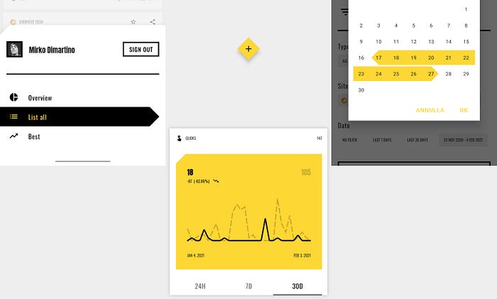
As mentioned before, the main combination is “black-yellow” but I only chose yellow as the primary color, leaving black as the predominant color on the surface.
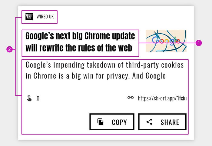
By “surface” in Material Design we mean the cards, which is the material of which an app is composed, or other high components in the background, for example action bars, dialogs, bottom sheets, buttons and so on.
For this type of elements I chose a neutral color, which would bring out the color I chose for the “color on the surface”, therefore pure white.
As a background color I chose a slightly darker color than the surface to make it stand out in turn.
The result is the following color scale:

I didn’ t use a “ColorSecondary” (or accent), but you may want to, it depends on the app you want to build.
5. Shape

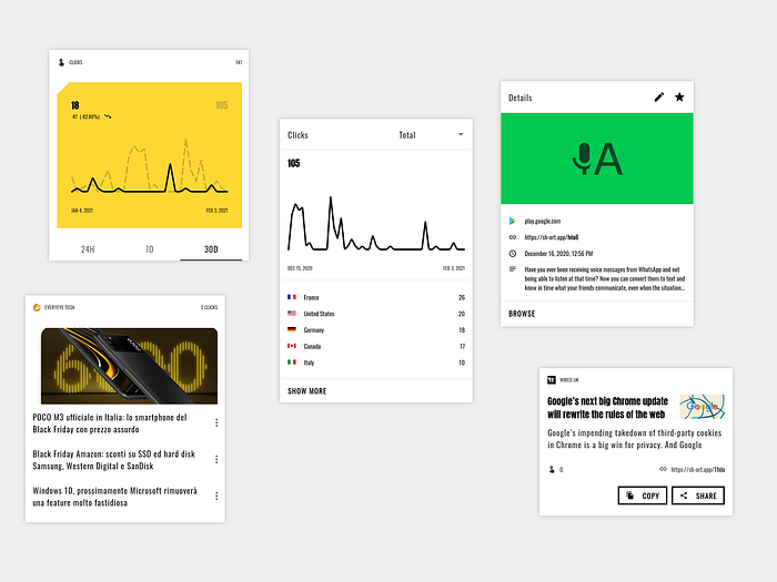
Sh-ort uses different cut shapes for small, medium and large components; this gives the app consinstency with icon and harmony with fonts used.
6. Motion
Animations are often underestimated and little used in android apps, if not the normal system ones, but they can give an extra push to accompany the user in his interactions with your product, or to make waiting less boring.
I want to show you some examples:
- Launch screen
The launch screens are not well implemented in most apps, but watch how thanks to motion it integrates well into the opening flow, transforming itself into the floating action button.
- Floating action button move and morph
In this case the fab moves to make room for the filter option, or expands to make the text field appear accompanying the user in the new action.
- Item edit and delete
In this example we can see how to animate a new activity giving consistency to the flow of the user when he wants to check the details of an entry and modify it.
Also see how an entry behaves when dragging it to delete it, giving visual feedback on whether it can be deleted or not.
Conclusion
This is a short essay on what material design really means and how it can help us brand our apps.
If you are interested in learning more you can download the app or leave a clap to see in detail how I have implemented all the things seen above.
Share with friends or colleagues 😎👍


